Lesson 8: Digital Imaging Assessment
Posted on: May 15, 2009
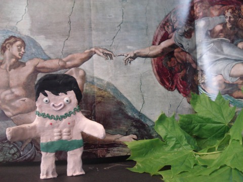
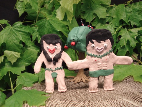
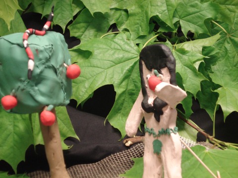
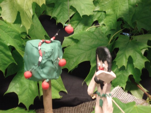
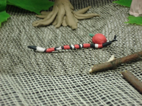
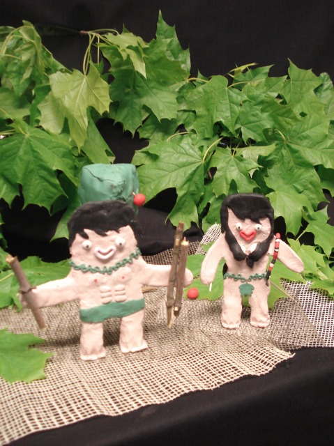
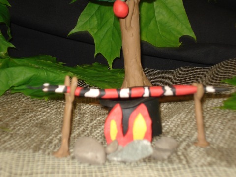
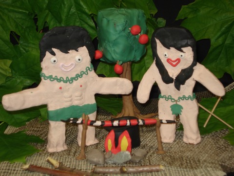
For our assessment Martin, Fergal and I chose to re-write the ‘love story’ of Adam and Eve. In our holiday snaps style story Adam is busy making the moves on Eve when she spots the snake, she acts quickly, catches him off guard, lobs an apple at him, knocks him off the tree to the ground… dead and they decide to celebrate good times and have a summer barbeque with satan the snake as the main course…. Bon appetit!
Lesson 7: Working with photographs
Posted on: May 8, 2009
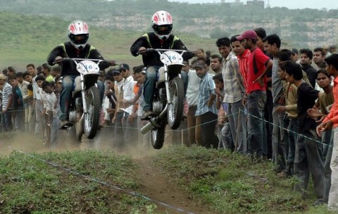
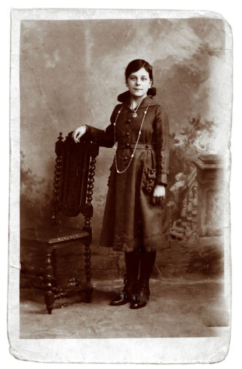
In today’s lesson we learnt how to use the crop tool, the healing tool and the clone tool. We worked on the two photographs above to practice using these tools. It was great!!
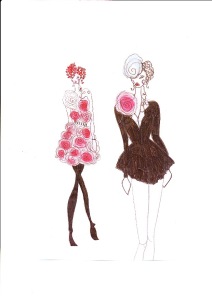
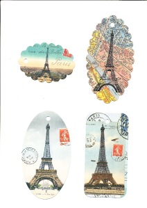
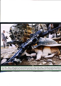
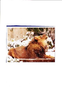
The images above are a combination of my fashion drawings, some little gift tag drawings of Paris I found in a book shop, a photo of a lion and a in Iraq who is being looked after by the American soldiers. I put up all these images just to show you things that interest me. I like the picture of the lion as it looks like it is the first time he has seen snow. Also the text under the puppy says : “Being on puppy patrol is hard work and every young pooch needs to take a break..grabbing 40 winks under a rifle and army hat in Baquba, Iraq. During their time in the country, so many American soldiers have bonded with stray dogs that a new rescue drive such as Operation Baghdad Pups have sprung up to help them take their four legged friends back to the United States. A case of puppy power”. Cool.
Posted on: May 1, 2009
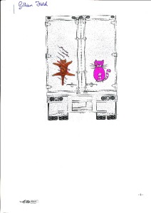
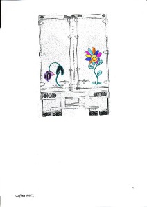
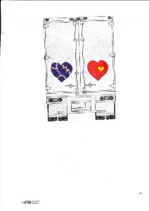
These trucks are part of our road signs exercise. we had to design three images relating to life and death situations on the road. We had to visually warn vehicle users of the hazards of passing out on the wrong side.
Lesson 6: Me, Myself & I
Posted on: May 1, 2009
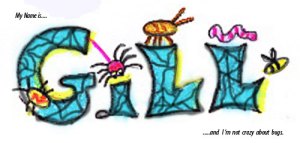
Today we played around with the pen and brush tools. We used our drawings from the ‘Me, Myself & I’ exercise to put into practice what we’d learnt. It was really excellent to start to really understand just how much photoshop can do wahoooo!!!
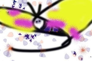
Today we learnt how to use the pen tool, brush tool, work with vectors, bit maps and selecting colours. We ended by doing a quirky heart exercise.
Web Critique
Posted on: April 24, 2009
The website I have chosen to critique is www.flybe.com. It is a website for booking cheap flights to various destinations. Overall I found the design of the homepage to be cluttered, fussy and distracting from the main purpose of the site .i.e. to quickly book a cheap flight.
While the basic layout was clear consisting of four coloumns of information, with the main site navigation placed on the left hand side and key information placed in the header and footer, the content placed within those core areas was too diversified in colour, typography, shape and design. There was a sense of information overload with too many advertisements for different services, moving images and price deals filling up the screen. The process of booking a flight can be stressful enough without the added distraction of too much information being posted at you, in strong colours of red and blue.
Also the large colour images in the central column meant the page took a while to download. In conclusion I felt this website could be vastly improved by simplifying the design, putting in less adds, no distracting moving images and focusing more on the mind set and needs of the user. Also it’s logo was completely forgettable.

Lesson 4: Adjustment Layers
Posted on: April 3, 2009
Today we learnt about hue and saturation. We followed this with an exercise on adjustment layers using Gerry Ryan’s face as a basis. It was a lot to take in for a complete novice and so the following exercise on creating a negative image of Amy Winehouse went really abismally 😦 I know what I will be doing during my Easrer Holidays – studying my notes….)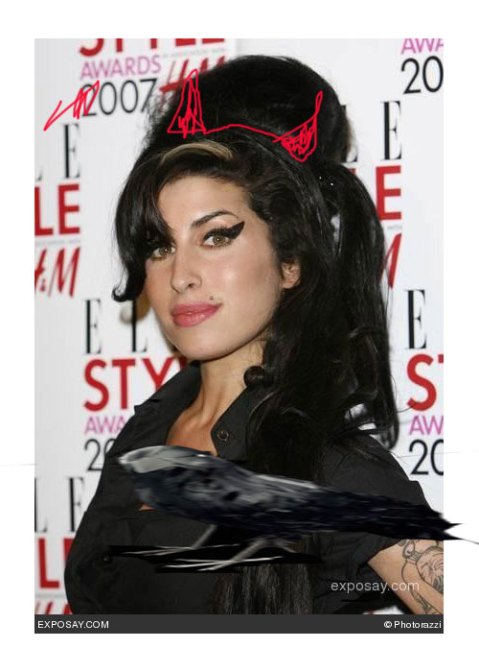
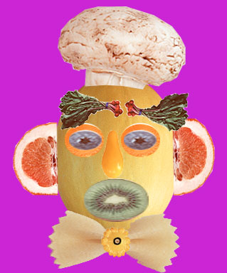
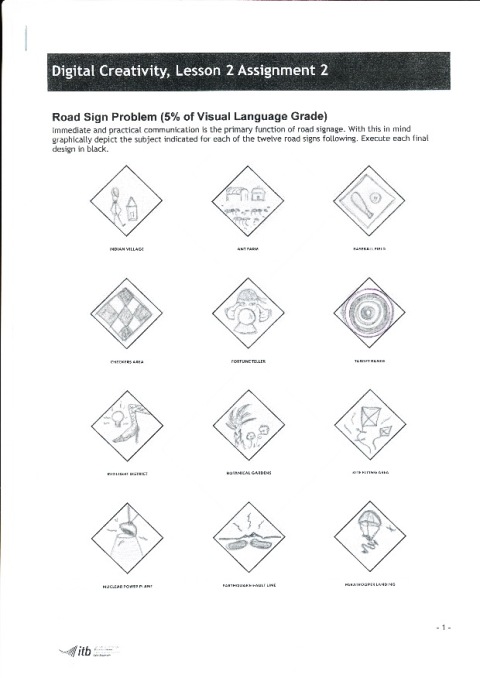 Today we started the lesson by uploading the fruithead image to our blog. We followed this with a recap exercise in photoshop using louis Walsh as our subject. We then uploaded the completed image of Louis to today’s entry. We also did home exercises on road signs and life and death road signs. I have actually placed the road signs in the wrong week but the fact that I have even managed to successfully upload them to my blog is an achievement in itself. It is 5.40pm almost time to shut up shop for the weekend and go home so I will perhaps attempt to fix them another day.

Digital Creativity: Lesson 2
Posted on: March 27, 2009
In last weeks lesson we looked at Photoshop Interface. It was fascinating, a whole new world. Afterwards we looked at all the different selection tools. We followed this with a practical exercise to create a fruit head in order to get used to using the tools.
Digital Creativity Lesson 1
Posted on: March 13, 2009
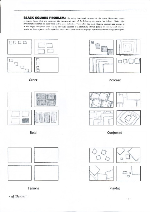 In todays class we did two exercises. The first exercise consisted of using four squares, of the same dimension, to create a graphic image that best expressed the meaning of the following six words ‘order , increase, bold, tension, congested and playful’. We followed this with a drawing exercise to create ten images that conveyed the meaning of the words ‘positive’ and ‘negative’. It was challenging but it got your mind thinking creatively.